Kinnick Stadium: Signage Completes The Experience
Successful football teams work from a playbook as a team. A common goal. Intricate Strategy. Clear communication. And when the pressure is on, they execute flawlessly.
The same can be said for building the stadiums where they play. When historic Kinnick Stadium in Iowa City was set to remodel the North End Zone, the University of Iowa teamed up with Neumann Monson Architects Architects and JE Dunn Construction to pull off a big win before the team was set to hit the field for the 2019 season. Our sign team, led by Bryce Carlson, was part of the special team that tackled outdoor signage and interior signage.

Iconic Stadium Signs
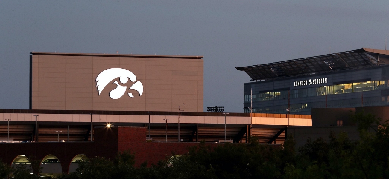
One of the signature outdoor signage elements of the remodel to the North End Zone of Kinnick Stadium was an enormous tigerhawk emblem. The original design was a 22’high x 36’wide reverse channel halo illuminated (backlit) aluminum sign.
As a manufacturer, we bring relative expertise and our fabricators like to show their team spirit on projects like this (right picture: Jason stretching a portion of the tiger hawk in his black and gold).
Our outdoor signage experts were concerned about having an aluminum sign that large. Due to the size of the overall logo, it was impossible to have a single sheet of aluminum big enough to make the sign. Seaming the aluminum was a possible solution, but that left potential for light to leak between the seams of the face.
To get the look, reduce the weight, and bring costs down on install, we suggested using Flex Face as it would allow for a one-piece face construction. It also makes it possible to illuminate the entire logo, not just create a halo. Changing the illumination also led to updating the stadium letters with a coordinating illumination style.
With Design-Build projects, our team was around the table early and able to deliver a stadium sign solution that now serves as a beacon to Hawkeye fans, and elevates the look of the entire stadium.
Distinctive Exterior Donor Signage
Donor support was imperative to funding the Kinnick Stadium North End Zone remodel, and the university wanted to honor their donors in style. The problem was, the area designated for the donor wall was too small to accommodate the many generous donors.
The design team turned to the donor wall expertise of Latitude Signage for help rethinking the placement and design of the donor wall. They challenged Latitude to come up with a signage plan that included photos and distinctive levels of donations. It also needed to be modular so it could be updated over time, but also secure enough to withstand the elements and thousands of people walking by it year after year.
The end solution included exterior grade stainless-steel signs that are silkscreen printed with images and names of major donors across the top of the donor wall. Below each of these panels is a column with modular strips that can accommodate a seemingly endless combination of donor names and messages. The linear overall look is well suited to the gridiron givers.
Box Seating Donor Signs
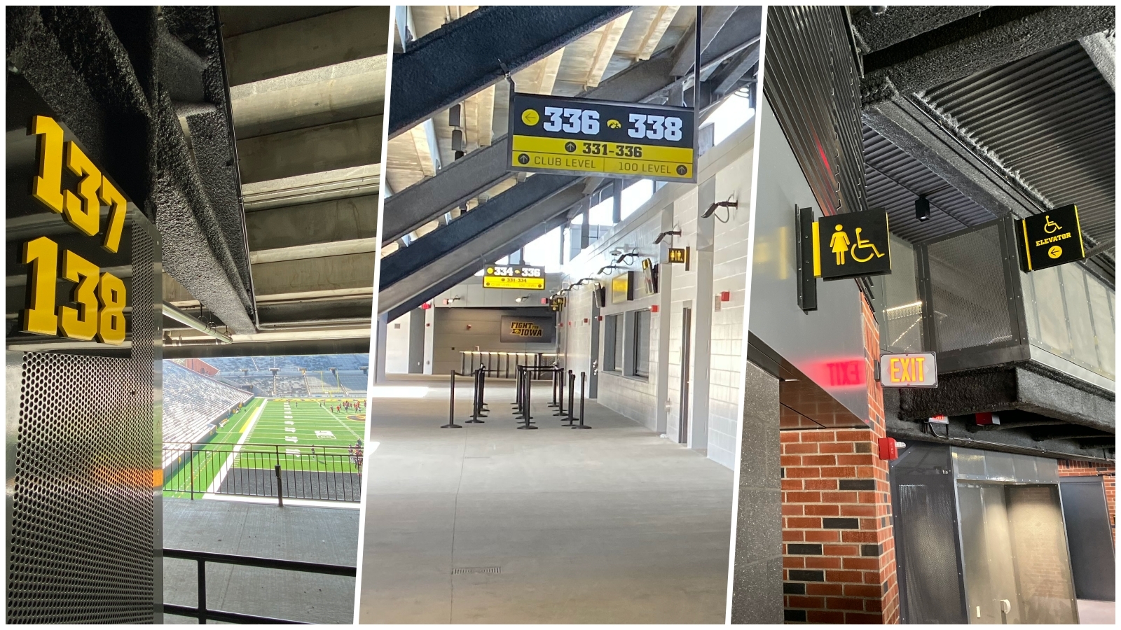
Within the stadium, donors who buy or rent outdoor box seats (also called Ironmen Boxes) enjoy privacy and more protection from the elements during games. They’re also greeted with their names on the door. Locker room inspired lettering and box numbers are installed on the brick wall near each ironmen box. Names of donors are hung directly on the doors.
Environmental Graphics Set The Tone
Another addition to the North End Zone remodel is the premium club level, Ted Pacha Family Club. Between the two concourse levels the premium club level is accessed through a new skywalk, elevators, and stairs. The club has its own concessions and restroom facilities.
In the club level, guests see environmental graphics of iconic moments in Iowa Hawkeye football history. These oversized silicone edge graphics energize the space, and they can be easily updated when the Hawkeyes have their next big moment.
Another eye-catching sign in the club level is the large tiger hawk near the stairway. The design concept was to keep the look open, but to have it illuminated with a stunning pattern. Collaborating with Neumann Monson, our team worked through several product tests to finally develop the sign in clear acrylic with yellow etchings that carry the surrounding LED lights through the acrylic for a dynamic stadium sign.
Stadium Signage Elevates the Experience
A big game might be won on a Hail Mary pass, but a successful season isn’t a fluke. It goes back to hours of preparation with everyone doing their part to execute the game plan and communicate with one another.
We pride ourselves on being a team player and our ability to provide workable solutions, no matter who designs, that are visually stunning and practical for the lifetime of the sign. From anticipating issues and providing an alternative solution, to cost-engineering and managing the timeline, we work side-by-side with clients to deliver a successful season year after year.
If you’re looking for a sign expert on your team to deliver signage solutions for your next project, bring us into the huddle and let us show you how we can elevate your signage game. Find your expert here.

RECENT CASE STUDIES
Signage Designs Become Reality at Kiewit Luminarium
Part workshop, part museum, part science center, Kiewit Luminarium is a one-of-a-kind community space and learning environment for people of all ages. More than 125 exhibits are housed in Luminarium’s machine shed-inspired building on Omaha, Nebraska’s RiverFront park.
Donor Funded New Student Center at Northwest College
Northwest College in Powell, Wyoming, started raising donations for a brand-new student center in 2016. Over nine years, many patrons came forward to support the project, which means Northwest College needed a way to display many donor names in the new facility. Thanks to generous donations from the community, the center opened debt-free.
Like what you see?
Get more ideas, design, and inspiration delivered to your inbox on a monthly basis. Sign up for our email, we won’t waste your time!