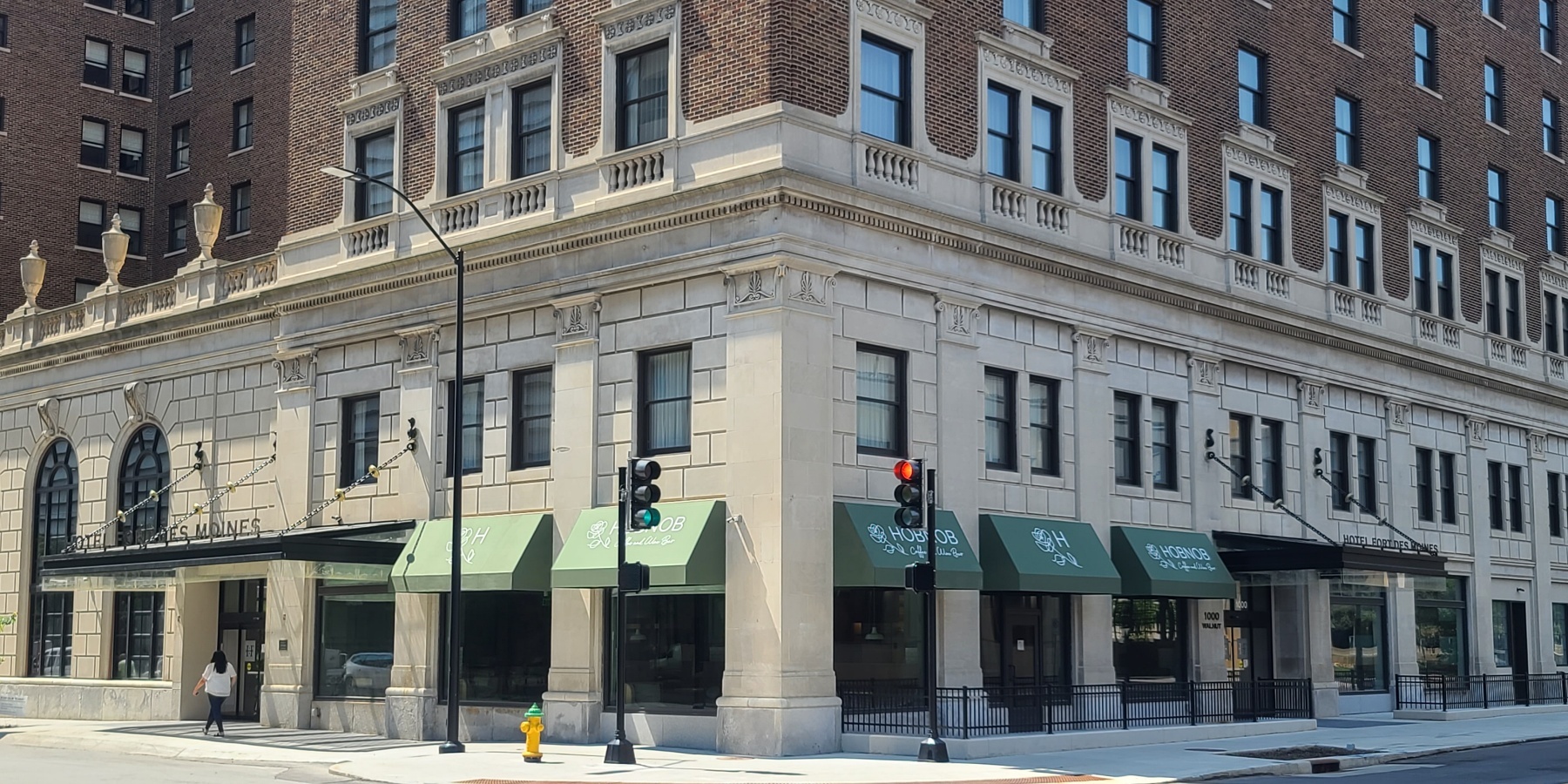
Hotel Signage: Making History at Hotel Fort Des Moines
A Historical Renovation
The 100-year-old Hotel Fort Des Moines boasts creative architectural signage as part of its complete restoration.
In the heart of downtown Des Moines, the Hotel Fort Des Moines has seen travelers come and go for more than a century. From hosting weekend vacationers to celebrities such as Elvis and Johnny Cash, the hotel is an iconic part of the city.
The hotel, which dates back to 1919 and is listed on the National Register of Historic Places, recently underwent a complete restoration. The project brought the property back to its former glory.

Exterior Architectural Signage
"When our sign team was awarded the design-build work we knew it would be a fun challenge. Any time you’re working with a historic property there are more details to take into consideration,” says Tony Squire, Business Development Manager for Latitude. “In addition to designing a distinctive signage package, we worked with the city to make sure all the exterior signage fit within the city code and met the regulations for a historic building.”
Above two of the entry doors, you’ll see exterior signage welcoming you to the Hotel Fort Des Moines in oxidized bronze letters mounted to a common rail that attaches to the canopy. The look is both chic and vintage. The bronze coloring of the exterior signage continues with the interior signage.
Historical Interior Signage
At first glance one may not notice the creative elements that went into producing this interior signage package for the hotel, but there was no detail too small for Latitude’s designers.
For example, room identifier signs and most ADA signs are black with bronze lettering. Take a closer look and there is a subtle pattern printed on the black acrylic sign. The pattern is made up of small repeating hotel logos. Many of the signs are also framed with the same metallic paint used on the lettering.
The gilded look doesn’t end there. For meeting rooms and special ballrooms, the signs are made of layered acrylic. The base is a clear acrylic painted with a metallic bronze. The top layer is the printed black acrylic with bronze caps. This elegant look honors the architecture and era of the building.
Architectural Signage Solutions
Using sophisticated finishes and materials isn’t the only thing that sets this project apart. Our designers gave a nod to the hotel’s roaring ‘20s history with restroom identifier signs that feature dapper silhouettes of men in top hats and women wrapped in flapper stoles.
Other creative solutions include flag-mounted signs made of acrylic that are designed to look like piping, and oak brackets (holding a printed canvas sign) that match the handsome woodwork found throughout the hotel.
“This was a very high-profile project,” Squire says. “There was a lot of pressure to design and build signage that would honor the history of the hotel and meet all of the requirements of making updates to a historical structure. I’m so proud of our team’s work. From the design stage to project management, the team’s creativity and ingenuity made this collaboration a success.”
Historical Building Expertise
Have questions about this project? Reach out to Tony Squire.
Find your expert for any questions on how to incorporate creative signage solutions within a historical structure.
Learn more about Historical Hotel Renovations here.
RECENT CASE STUDIES
Signage Designs Become Reality at Kiewit Luminarium
Part workshop, part museum, part science center, Kiewit Luminarium is a one-of-a-kind community space and learning environment for people of all ages. More than 125 exhibits are housed in Luminarium’s machine shed-inspired building on Omaha, Nebraska’s RiverFront park.
Donor Funded New Student Center at Northwest College
Northwest College in Powell, Wyoming, started raising donations for a brand-new student center in 2016. Over nine years, many patrons came forward to support the project, which means Northwest College needed a way to display many donor names in the new facility. Thanks to generous donations from the community, the center opened debt-free.
Like what you see?
Get more ideas, design, and inspiration delivered to your inbox on a monthly basis. Sign up for our email, we won’t waste your time!