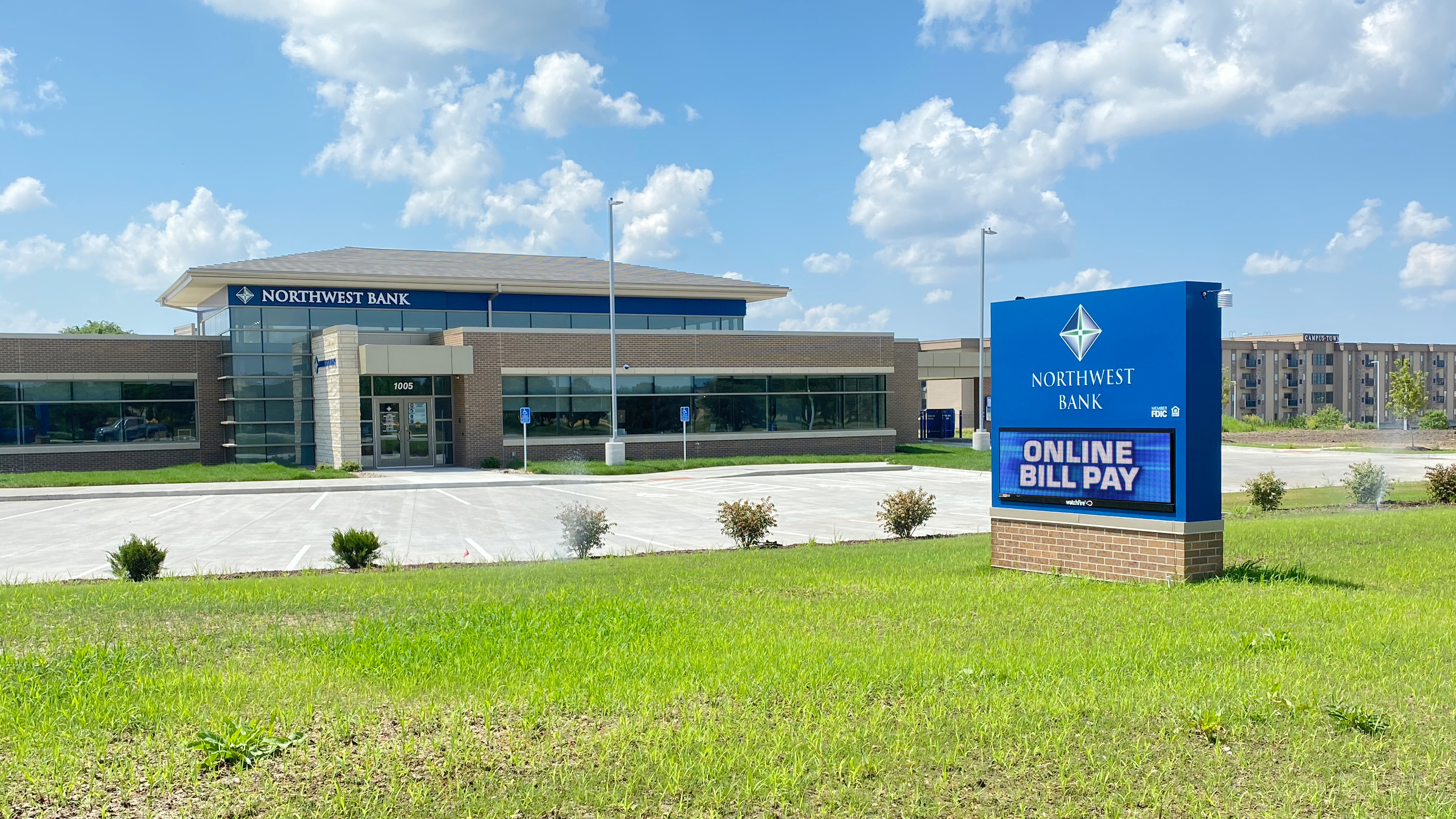
Exterior Signage for Banks: LED Signage Offers Flexibility at Northwest Bank's New Ankeny Location
Getting Digital Signage Right Takes a Partnership
A great exterior branding package starts with a great partnership. The Northwest Bank team had envisioned a sign to proudly display their brand and for this project, there was more involved than their name on the building. Our team partnered to work through the city signage code, design creative options, and solve their need for a sign that could display variable information.
Our friends at SVPA Architects always make for great partners, “leaning on each other as collaborative resources are the key to everyone's success” said Pat Mescher, sign expert on this project. "We managed the process of researching the signage code with the City of Ankeny to ensure all signage met requirements before any production got off the ground."

The building signage looks great, especially at night.
Digital Signage to Help Grow Business
The Northwest Bank digital sign had to deliver on a lot of items.
It needed to display variable information from rate changes to clock time. It must deliver bold branding and be as attractive as the location. In a suburban Des Moines community, this bank sits on an Ankeny busy four-lane thoroughfare. In this booming suburb where commercial and residential development is on the rise, the potential for growth of this new bank is limitless.
A monument sign with a central LED message fit the needs. Read more on reasons and tips for LED signs here.
Balancing LED Signs for City Code
Easily the biggest challenge of this branding project was ensuring that the monument sign fit code, but also did its job. It’s important to size an LED board so messaging is effective for the speed of traffic and viewing distance but also enough ‘sign real estate’ to get branding within the full monument sign.
Larger similar signs have been installed in this area, but the zoning PUD of this particular location dictated the size. Then it was up to us to come up with a concept that “fit” for all parties.
Building Bank Branded Architectural Signage
Working closely with architects allows us great access to material specifics. For the signage on the building, we used the exact same architectural wall panels. By doing this the sign could be fully constructed in our Grinnell, Iowa facility, and more easily installed; we constructed it as one large piece vs. individual letters to simplify the installation process.
Visibility is key for banks especially. On the building itself, there is a north-facing logo and an east-facing logo that corresponds with the path for the approach to the building. The east-facing logo is dimensional lettering installed on a limestone rock wall, which is tricky with the unevenness of the material this is a timely and thoughtful install for this type of situation.
Have questions or want to learn more about anything signage related?
Find your expert here or shoot us an email and we’ll connect!
RECENT CASE STUDIES
Signage Designs Become Reality at Kiewit Luminarium
Part workshop, part museum, part science center, Kiewit Luminarium is a one-of-a-kind community space and learning environment for people of all ages. More than 125 exhibits are housed in Luminarium’s machine shed-inspired building on Omaha, Nebraska’s RiverFront park.
Donor Funded New Student Center at Northwest College
Northwest College in Powell, Wyoming, started raising donations for a brand-new student center in 2016. Over nine years, many patrons came forward to support the project, which means Northwest College needed a way to display many donor names in the new facility. Thanks to generous donations from the community, the center opened debt-free.
Like what you see?
Get more ideas, design, and inspiration delivered to your inbox on a monthly basis. Sign up for our email, we won’t waste your time!