Favorite Signs of 2019 - Winner Announced!
January 2020
The Latitude, Latimer Group employees nominated their favorite monument signs, ADA signs, building signs, and donor walls of 2019. Below you'll find more pictures and details.
After a week of sharing and liking on Facebook and Linked In the public has determined the Favorite Sign of 2019. Check out all the nominations below and on our Facebook page too.
The results are in! A 22 foot tall Tigerhawk wins!
Congrats to all our friends and partners at the University of Iowa and the University of Iowa Athletic Department. Our heartfelt thanks and appreciation to their team for trusting us with your stadium and your strong brand.
The candidates were...
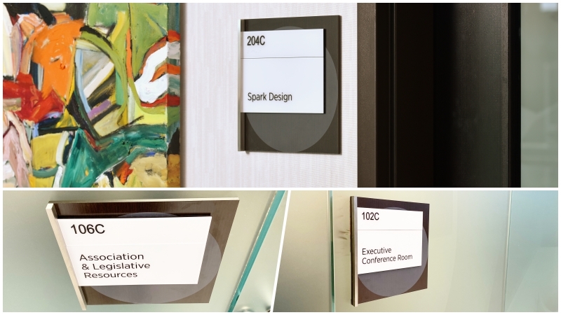
☝🏻 ADA Office Sign - Uses Wood and Metal from Interior Design of the Corporate Office Building
Project: R&R Realty's Westfield Campus Corporate Office Building
Custom ADA interior signage incorporates this corporate building’s architecture in the design. The exact, dark prefinished wood and metal used in the building interior design package was used for the signage.
All of the sign types have dimensionality through layered panels and a vertical metal accent. Dimensionality continues with the application of graphics to create visual volume and draw the eye on an otherwise dark panel, and often dark wall surface. This particular sign type allows for changeable office suites in this ever-evolving corporate office building.
Check out the CASE STUDY to learn more about this project.
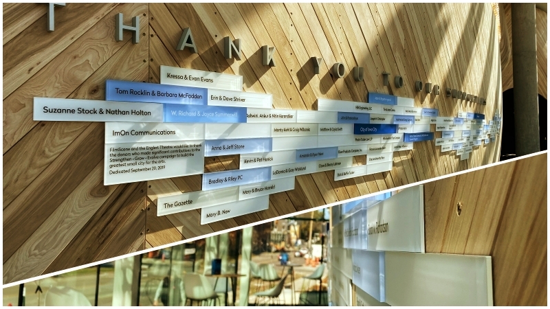
Dimensional Donor Wall for Mixed Use Facility in Iowa City
Project: FilmScene Cinema, Iowa City
This simple yet sophisticated donor wall uses acrylic panel size, color, and thickness to pay tribute to the donor levels of those that helped bring this theatre to life.
The panels are a clear acrylic back-painted which adds an additional “glow” in this naturally bright space. Donor names are on the face of the panels which adds to the dimensional experience. Rectangles seem simple but installing them to a wall that is both curved horizontally and vertically is quite sophisticated.
From concept, to design, to installation, the curved wall was always a factor to ensure the quality and craftsmanship of this donor wall.
Check out the CASE STUDY to learn more about this project.
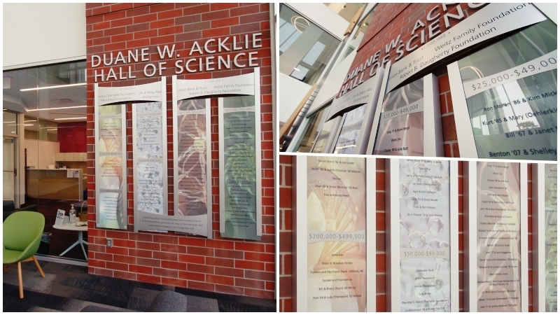
Donor Wall for Higher Education Science Building
Project: Nebraska Wesleyan Duane W. Acklie Hall of Science
The donor wall design inspiration comes from the metal window treatments and the clean, geometrical elements of the building. Curves complement the style of the building and interior decor. Background images highlight the three major disciplines taught within, with the 4th panel depicting a golden ratio spiral: a conceptual theory that all disciplines share or find some relevance in.
Donor names are digitally printed on clear films that can easily be removed and replaced without the need of reprinting the graphic panels. To do this a custom angle bracket was designed with the vertical bars that snap into Latitude Infinity chassis giving a seamless and concealed look to the installation.
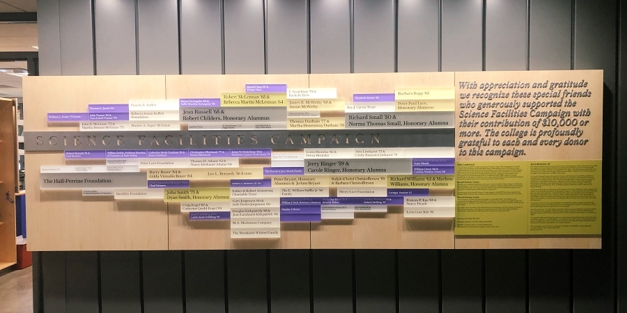
Donor Wall for Science Facility
Project: Cornell College Science Facilities Capital Campaign
This modular donor wall allows the addition of donors to this capital campaign in the future. The design was purposeful to show donor giving by varying panel sizes and thicknesses based on levels and laid out in an interesting and random layout that allows the wall to grow as needed.
The base of the wall is light maple wood with a routed aluminum panel centerpiece on maple to reveal “SCIENCE FACILITIES CAMPAIGN” letters.
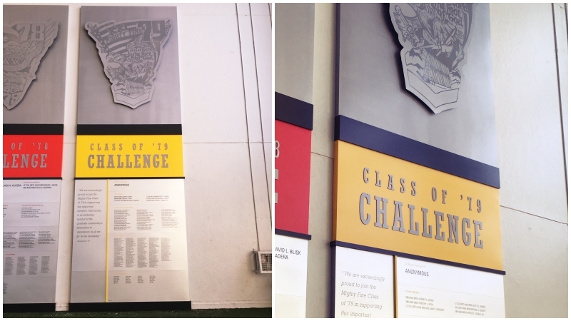
Donor Wall in Athletic Practice Facility
Project: Air Force Academy Class of '79 Challenge
An upgrade needed to happen for the Class of ‘79 Challenge donor wall. The previous version was not durable enough to withstand the constant abuse of its environment inside the Falcon’s practice facility.
Standing at 28 feet tall, the ‘79 Challenge was created in a way to replicate the ‘78 using aluminum and digitally printed graphics for the main structure, letters, and large graphics.
This is a finite donor campaign, no additional names will be added, so the wall is "static." This allows for a simpler design using acrylic with subsurface applied copy, which is a more durable process, which works well for this project.
Here's another Air Force Academy project you should check out.
Illuminated Environmental Graphics using Silicone Edge Graphics for Stadium Endzone Club
Project: University of Iowa Kinnick Stadium's North Endzone
These 10-foot tall silicone edge graphic (SEG) panels enhance the experience and excitement of Hawkeye football in Kinnick Stadium’s new North Endzone. Each is illuminated and changeable if needed in the future.
The 14 panels stand tall and proud with imagery from historic moments at Kinnick to current day teams and tributes.
Here's more on graphics.
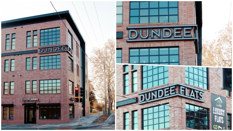
An Alternative Channel Letter Raceway for Exterior Building Signage at New Apartment Complex
Project: Dundee Flats Apartments
Great visibility and linear design are features of this unique and corner turning building signage.
Instead of using your traditional "Channel Letters" this sign is designed with two continuous channels that act as the "raceways" above and below the letters. The letters are mounted between the channels via 1" diameter tubes which trapped the letters between the channels and allow for the wire management necessary to power the letters. The tubes are painted the same color as the brick facade giving the letters the appearance of floating between the upper and lower channels.
The letters and channel have a thin stroke of push-through translucent acrylic illuminated by RGB LEDs that can change colors as desired. By using push-through acrylic in the channels, the "raceways" function for both power to the letters and as an integral part of the design by creating a pinstripe effect and further highlighting the letters. The letters are also back-lit using LEDs that add an extra punch with a wash of light.
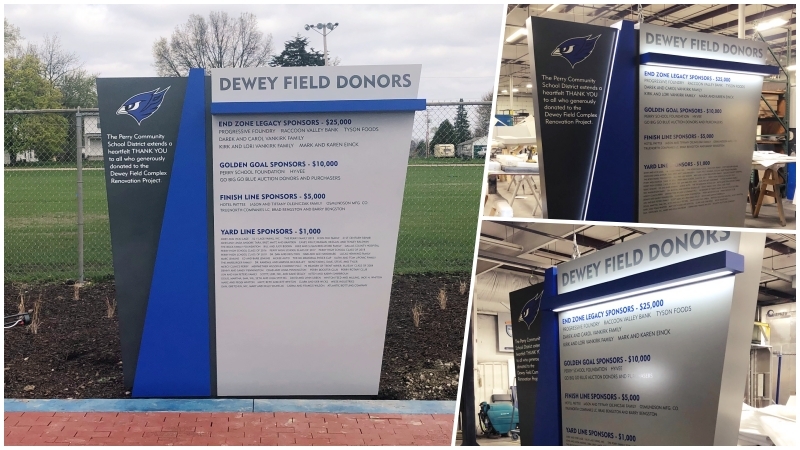
Exterior Donor Wall Monument Sign for Outdoor Athletic Fields
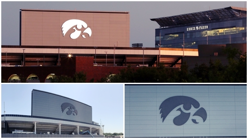
Exterior Team Logo Sign for Big 10 Stadium
Project: Perry Community School District Dewey Field
Designing exterior donor pieces can be tricky. Material choices are limited due durability issues with harsh weather conditions and the flexibility (like adding more donor names) you need to plan for on any donor wall.
This athletic complex donor monument has clean lines to give the sign a more athletic and futuristic look. The layering of the shapes and canopy allowed ideal space for installing the LED lighting. The LED downlighting and sidelighting create a dramatic look and allows for legibility at night.
For the flexibility factor, open space was left for future donors and vinyl verbiage and donor names were used for the ease of updating/adding names. Go Bluejays!
Project: University of Iowa Kinnick Stadium
This 22 foot tall, 36 foot wide, 4 sectioned tiger hawk is the cherry on Kinnick Stadium. The sign face allows the edge to edge lighting (no trim cap) because it uses a 3M dual vinyl that allows light to come through when illuminated. So the tiger hawk can be black during the day and white at night for optimal viewing distance against the night sky.
The flex face design allows the vinyl to be stretched across an aluminum framework which makes the sign lighter weight. This lighter weight sign product is a smart option due to wind load because it’s final home is 5 stories up in the air and installation costs. Go Hawks!
Here's a VIDEO that includes the timelapse of building the sign and installation.
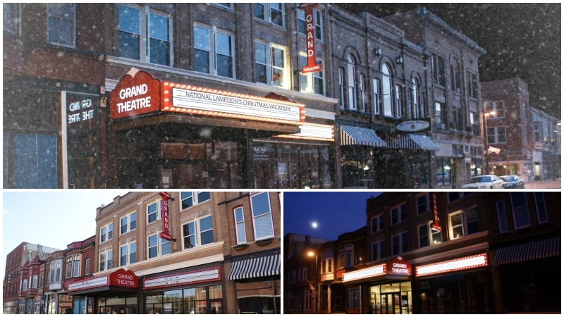
Historically Designed Theatre Marquee Sign
Project: Red Oak Grand Theatre
This theatre from the 1930s has been revitalized and the marquee sign is now highly functional with an affectionate nod to it’s past. The design was intended to keep that small town, slowed down the charm of the community while also being a high functioning, durable, and budget-friendly. The classic-looking theatre sign has a changeable letter board and LEDs.
Read the CASE STUDY to learn more.
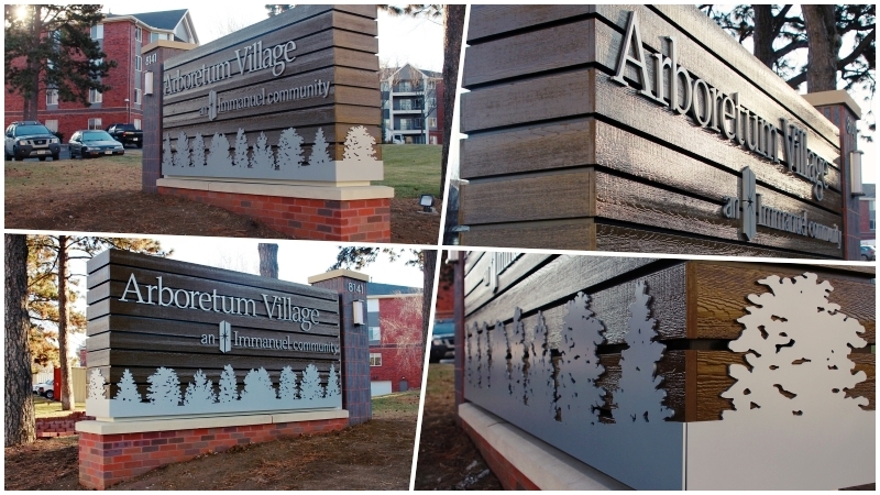
Lush Surroundings Inspire Monument Sign Design
Project: Arboretum Village an Immanuel Community
The Arboretum Village architectural design was inspired by it’s lush surroundings and so is the monument sign.
To give it a rustic yet refined look, textured composite planks were incorporated. This allowed for the look of real wood with lower maintenance and longer lifespan. The wrap-around dimensional tree-line gives it a unified look on three sides of the sign and creates a "landscape" environment for the Arboretum Village logo to float above it. Both were painted with a metallic aluminum color to give it a clean look and to contrast with the rustic look of the planks.
The same brick scheme of the apartment units was used for the base. A light brick for the main base and a darker brick for the upright bollard creates a nice contrast for the address to be mounted and sconce light fixtures that match those used elsewhere in the complex.
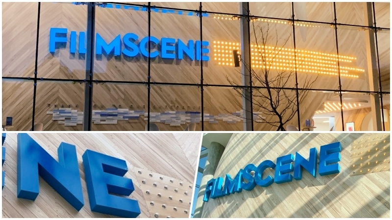
Trimless Illuminated Channel Letters Prove Clean Lines for Mixed Use Building Signage
Project: FilmScene Building Signage
These timeless channel letters at FilmScene in Iowa City take illuminating letters to a new level. Unlike a more commercial looking “channel letter” these letters have a smooth and finished face and return along with illumination to the edge since there is no trim cap. Architectural lettering at it’s finest.
Check out the CASE STUDY to learn more.
Like what you see?
Get more ideas, design, and inspiration delivered to your inbox on a monthly basis. Sign up for our email, we won’t waste your time!