Top 5 Outdoor Signs
It’s great to be outside, where you’ll find these great exterior signs! We hope you enjoy these and maybe find some inspiration for an upcoming project.
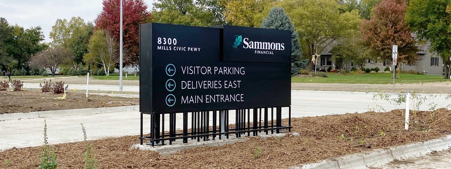
Stilted Exterior Wayfinding Signage at Sammons Financial Group

The linear accent lines of this design carry through all the signage (exterior, interior, and digital) on Sammons Financial Group’s new corporate campus located in West Des Moines, Iowa. This directional sign is a favorite because of its unique design and fabricated steel cage ‘base.’ The design influence for the cage came from “old banker’s wire”. 2” steel posts are flange mounted to the concrete pad. 1” square steel tubing is then welded to the cabinet to provide the design aspects for the ‘caged looking’ base. Principal LED tap out sticks provide ample internal LED illumination for these signs.
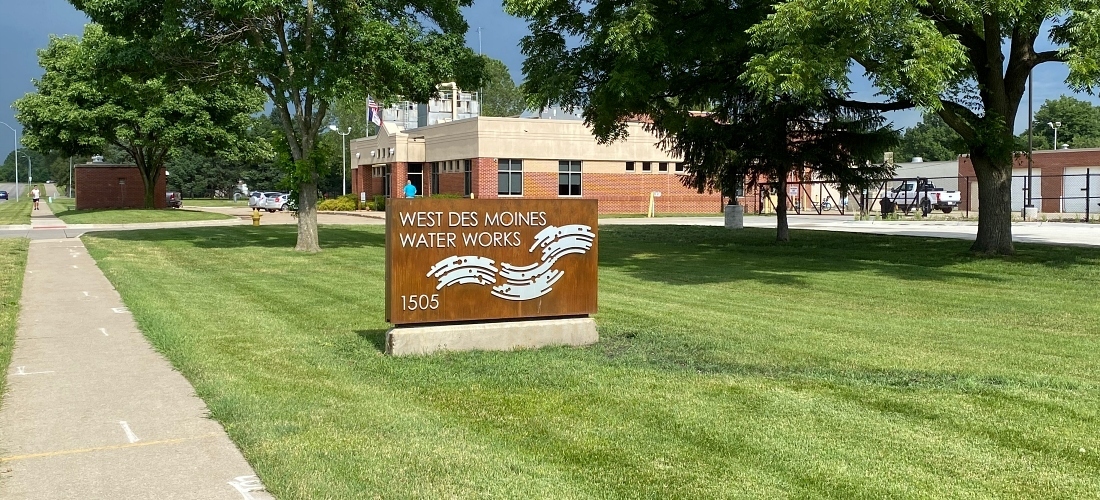
Faux Corten Steel Routed Aluminum Monument Sign at Des Moines Waterworks

Using our faux rust paint finish on aluminum, this great-looking monument sign also has matching directional signs. The design intent of West Des Moines Waterworks makes sense, water on metal creates rust. Since aluminum was used, instead of steel, this allows us to cnc-cut and fabricate an illuminated cabinet with push-through graphics and LED illumination. Steel would be more difficult and less cost-effective for internal illumination and installation. This 5’ tall by 7’ wide monument definitely achieve the goal at this new facility.
A Legacy of Champions Monument Sign at Van Meter School District

This thoughtfully planned monument/pylon sign is designed for growth & modularity, especially with the way Van Meter High School racks up state titles. This 16’ 6” sign stands tall with 12 panels on each side to cover each sport, then the years can be added to that sport’s panel with a vinyl update. Dimension is added with a 4” deep “VM” channel letter logo and the entire aluminum cabinet has CNC-cut graphics and is illuminated with LEDs. 6” structural steel ensures the sign will be standing tall for years to come!
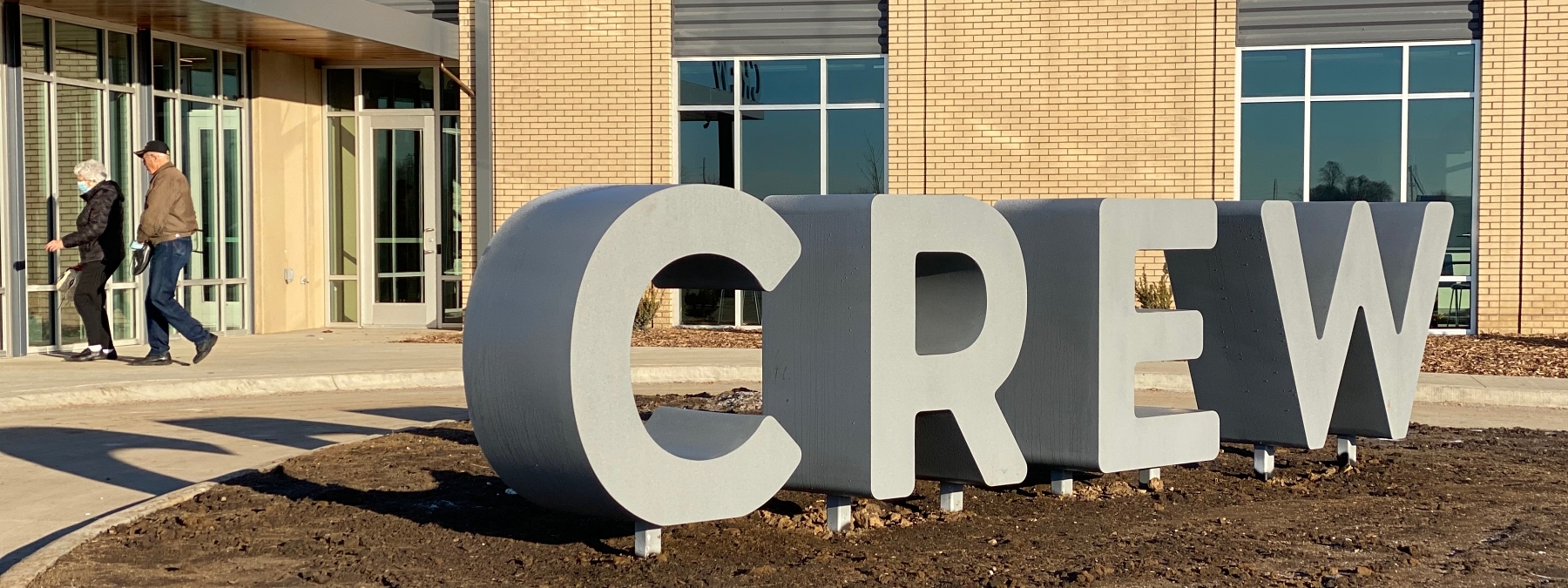
Dimensional Letters Worth Crawling Over at The CREW Community Center

You might say, these letters have depth & texture at The CREW Center! At 24” deep and 4’ tall it was imperative each of the “C-R-E-W” letters have adequate support to withstand the weight of children. The assembly consists of 2” square steel posts for internal bracing along with 3” steel posts for direct burial through a concrete pad and footing. These letters will support the weight and the durable finish coat is a bed liner type finish for a more ‘gritty’ texture rather than a typical smooth finish.
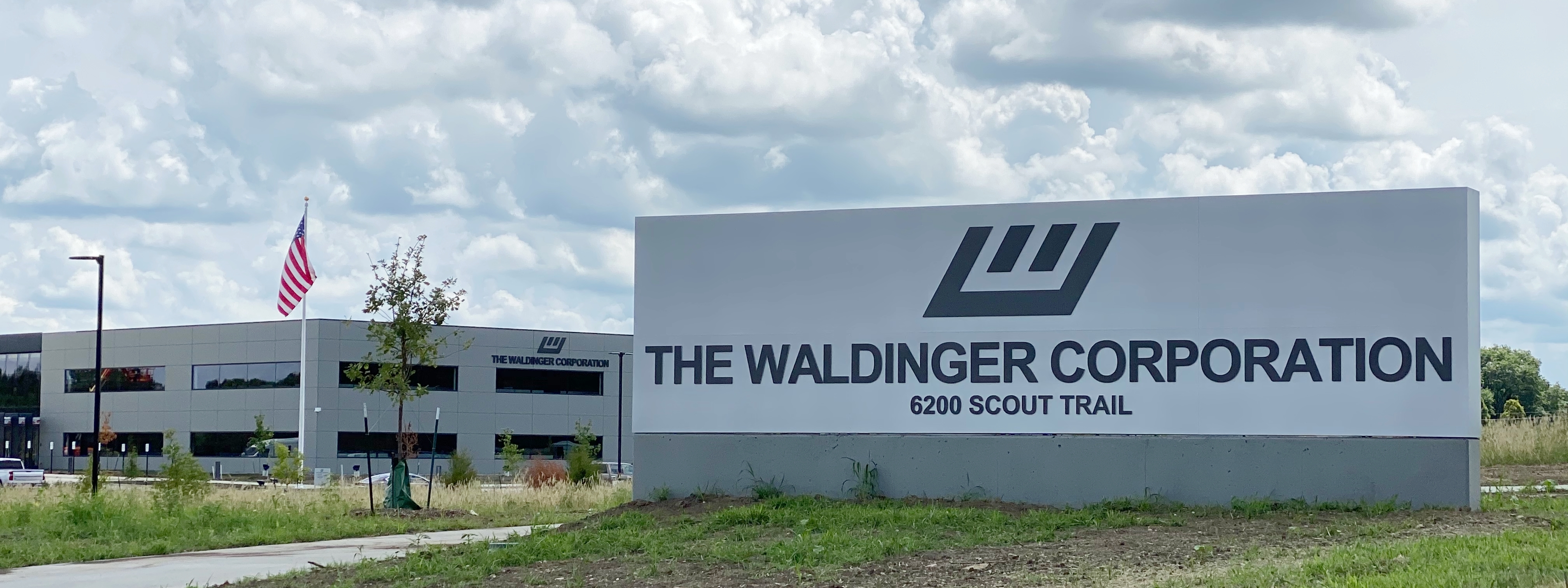
Outdoor Sign, Simple and Solid at The Waldinger Corporation

This rather simple design serves its purpose well along a very busy road. 12” high copy on this 8’ tall by 24’ wide monument sign is a clear sign of The Waldinger Corporation’s new corporate headquarters. The letters are created by cnc-cutting the aluminum and pushing through acrylic to have a ½” deep letter with a painted letter finish overlay that achieves a halo (glowing) effect that really lights up the night.
If any of these designs or materials inspired you, let's talk. Find your expert here.

Like what you see?
Get more ideas, design, and inspiration delivered to your inbox on a monthly basis. Sign up for our email, we won’t waste your time!